This week our Season 20 designer are discussing flatlay photos. Up today is editing and finished photos. Scroll to the bottom for links to the other posts in this mini series.
Hi, I'm Susana from Suco by Susana, and welcome to part 3 of the Flatlays blog post series! Today we're taking a look at lighting and how to edit your photos to get beautiful flatlay photos of your creations.
Let me just start by saying that I'm not a professional photographer. I'm a pattern designer, a mom who sews, and I take my own photos for my patterns, listings, website, and social media. I take most photos with my phone, and I know a bit of how to use my DSLR camera (so that I don't have to shoot in full automatic mode). :-) My photographing skills and knowledge have been improving over time, and I'm happy to share some tips that work for me.
As Monica wrote in part 1 of this blog post series, lighting is very important. Ideally you would set up your gear next to a large window with lots of natural light coming in in just the right angle, and wouldn't need to use anything else. However, most of us (me included) don't have a perfect setting to take photos in our homes, so sometimes we need to use a flash, or edit the photos later.
Most smartphones today have really good cameras and lenses, and you can even adjust some simple settings while shooting, so you can take gorgeous photos with them. IrisfromIris Maysays that "when using a mobile phone (an Iphone or any Android phone) you can manage the brightness of your picture right before shooting. Tap the screen before taking the picture and a sliding bar with a sun symbol will appear. You can move the sliding bar with your finger to make the image brighter or darker."
If you have a DSLR camera you can use a specific lens. Iris uses "a light sensitive lens (50mm) with which you can take very bright indoor pictures by opening the diaphragm". Lenses can be expensive, but you can find good 50mm ones for around €100.
If you still don't have enough light, for example if you're shooting at night or if it's a very dark day, you'll need to use a flash. Here the first rule to remember is to notuse your camera's built-in flash. It produces a very bright and harsh light, pointed directly at what you are photographing, so it creates deep shadows and the result is not pretty at all.
What you can use is a Speedlite flash. It attaches to your camera's hot shoe, and you can rotate it to point at the ceiling or a wall behind you. This way the light bounces off the ceiling (or the wall) and brightens up the room without creating shadows. You can find good and inexpensive speedlite flashes on Amazon that fit most brands of DSLR cameras (for my Nikon camera I have a Neewer 750II TTL that costs a little over €50 on Amazon.) If you decide to buy a Speedlite just make sure to choose one that fits your camera's particular brand and model.
In these photos you can see the difference of shooting with or without a Speedlite flash, and also with a smartphone. The first one, with no flash, is obviously very dark, and would need a lot of editing. The second one is bright and has no shadows at all. The third one, with the smartphone and no flash, is also bright but has some soft shadows giving it a more natural look.
After all that comes editing your photos. First up you don't need any fancy editing software to edit your photos. I think that most people use Adobe Lightroom to make simple edits, I have Photoshop but I don't really know how to use it :-), and you can use any program that you have (free or paid).
If you took care to shoot the photos in good lighting and background, you won't need to edit a lot. You may need to crop and rotate the photo, and to adjust the brightness or contrast. If you need to brighten the whites, turn up the exposure just a little. Simple edits can make a big difference. When posting on Instagram you can even edit all this right inside the App in your phone.
I took the photo below with no flash because I had sufficient light coming in the window and it just needed a few editing to have it as I wanted.
I hope you liked this blog post series, and that you found our tips helpful! If you're on Facebook, there's a group where you can learn a lot, share tips and get help with your pdf pattern photography called PDF Pattern Photography Posse.
Happy sewing!
Susana
Flatlay photos arrived on the Project Run & Play scene a relatively short time ago. Their purpose is to level the playing field by helping the public focus solely on the clothing when they are voting. But flatlay photos are hard! Perhaps they can even be described as an art!
The extremely artistic flatlay photos of the Season 20 designers are undisputed in quality. So I asked them to put together a series of posts to help the rest of us in our flatlay photo game! Here's the schedule and the main contributors:
This week our Season 20 designers are discussing flatlay photos. Up today is the STYLING of flay lay photos. Scroll to the bottom for the schedule and links to each post.
I was asked to show you how I did my flat lays. I have te be honest and tell you am I no expert. I just followed my gut and looked at other flat lays I liked. The first thing I noticed in others flat lays was that they add little details. Details like toys, scarfs anything to make the outfit complete. Shoes are one of those details a complete flatlay has. I'll get to that on my third week flat lay. Fitst lets check out week 1.
In week one I was making my first flat lay. I wanted the outfit to show all I made plus the theme. So I played with adding little details. In my flat lays I added coins. Tulips, because you see a lot of flowers added to flat lays and the contributed to the theme. The whale was added by my son because of the water fabric. As you can see in the pictures below it took me a while to lay it all in a good one.
Left to right. As you can see I played with different back grounds. I found that plain white works best for me. I used a white paper back ground. Placed this on the ground. Climbed on top of a bar stool and balanced while playing with iso and F-stop settings.
As you can see in the first picture the flat lay is missing something. Next flat lay it just does not seem to add up. At the last flatlay the sleeve seems to be holding the flowers and it all connects. Everything is touching each other making it one whole outfit.
Week 2 I did not have shoes but had the dress and other items to show. I wanted to add flowers again and choose one that is similar to the dress shape I chose. The dress had to be the center of the picture. Also, with this one I used my external flash that I pointed towards the ceiling to get rid of the shadows you can see in the week 1 flat lays. An external flash does not have to be expensive and is worth the money. My first thought was to complete the circle in the circle skirt. Now the key to showing a skirt well is to actualle add the creases. Lay it out like the way you see it when it is worn. Check out the week 1 flat lays and you will see I even added them to the straight skirt there. It will make your flat lay less 2D and more 3D.
With the week 2 flat lay I tried to see what it looked like when I made it all a bit more messy. Can you see how it works better making it all connect again due to the circle? Again I added a toy.
With week 3 I initially forgot to add the shoes. You can see in these pictures that after I added them it looked much better. See how the last one works best. The jacket is holding the bag making it all connect plus there is a square shape in it all making it easier on the eyes.
As you can see I added something extra to each flat lay that adds to the outfit that is shown. You want it to be subtle. Flowers almost always work, though with the last outfit flowers would not be the best choice. The light box however added to the Roar theme the outfit had. After these three weeks I can honestly say that getting a good flat lay is a work of art. I can't wait to create one of those running flat lays Christina made. They look so fun!
If you are planning your flatlay photo, first think of your outfit. Is it colourful, classic, modern or inspired by nature? For me, this is the first item I check.
For the nature inspired flatlay I just walked around and collected things I found beautiful. My boys found some gorgeous feathers, they kept in their rooms, but they were so kind to lend me them for a while. I also found some driftwood, which matched perfectly to the colours of the outfit. Sticks, stones, pinecones or other natural things are always a great deal for an outdoor outfit. Please keep in mind, which things are kind of modern at the moment (as driftwood or pinecones) - this could sometimes be more appealing than other things like normal stones or some ground.
For the green outfit it was clear that I only would collect greenish things. So I found an old wooden robot at my kid´s room and bought some wooden green beads. I only buy things I know, they would be useful in the future. As I am teacher everything can be useful ☺. The green penny board I found by accident. I wrote on facebook, if anybody has one to lend me for a photo shoot and it was a friend of mine, who had a total green skateboard. This was luck, but I proved the experience that you only have to ask and people love to help for creating a great photo. Maybe you can make some nice photos of them in return.
The third outfit was really hard. It was the baptism outfit for little E. and it is very classic. So if you have a very classic outfit you can´t add crazy stuff on it. I went into the forest and collected a really old stick. This would be something like a clothes line. I was searching for really cool clothespins, but wasn´t successful. So I had the idea to take my cord, I sometimes use for hoodies. I just cut off two little pieces and wrapped it around the stick. I let the other ends of the cord disappear under the clothes. My husband suggested to add two little wooden animals, little E. was given, when he was born. I thought, this would be a great meaning for the picture. For a classic outfit, it is necessary to keep the photo clean. The two little animals are enough. More of them would make the flatlay too restless and overloaded.
For my last outfit, it could be a crazy flatlay. Colours everywhere are allowed. I kept the rainbow theme to direct the view on the beautiful rainbow fabric. So I bought these really yummy rainbow sweets and arranged three of it for my three boys. Of course they ate it afterwards. I also had that wooden rainbow for my baby at home, which was a great ingredient for the flatlay. Only the camera was bought – I bought it for M., because it was such fun shooting photos with him. I think, kids could sometimes get presents without an occasion.
I hope I could help you a little bit for finding the right ingredients for your flatlay. Please always remember, that there is no right or wrong. Flatlays should be fun and I am sure, there are tons of ways to create your perfect flatlay.
Flatlay photos arrived on the Project Run & Play scene a relatively short time ago. Their purpose is to level the playing field by helping the public focus solely on the clothing when they are voting. But flatlay photos are hard! Perhaps they can even be described as an art!
The extremely artistic flatlay photos of the Season 20 designers are undisputed in quality. So I asked them to put together a series of posts to help the rest of us in our flatlay photo game! Here's the schedule and the main contributors:
Day 1 (today) Flay Lay Photos {Part 1 - Behind the Scenes}
Here's what An of StraightGrain had to say about her Signature Style creation:
#1 Käferlgschaft - Colour Your Life
I absolutely adore this outfit. It is colorful but not childish, boyish but not boring, streetwise but not over the top. The outfit is full of original details without being clownesque, and the styling and photography are on point. M seems to be absolutely happy in his new clothes, and I can completely understand why! I always feel that sewing an original outfit for boys is extra challenging, because many more restrictions apply than for a girl's outfit (basically almost any boy's outfit could also be worn by a girl, but the opposite does not apply at all). But this creation proves that it is absolutely possible. Great work!
Our 1st place winner will be rewarded with:
Cricut Maker and starter kit from Cricut ($600+ value) 2 x 2 meters of choice fabric + 5 buttons x 2 models of choice from Atelier Brunette ($110 value)
For a chance to win some fun prizes yourself, enter the link up here. Remember these prizes are really huge and you don't want to miss out!!! Sew along closes June 2.
How time flies! And now it's time for the last week (can you believe it??) and the theme that is a crowd favorite: Signature Style! Now our top 3 designers from Europe are here to share their Signature Style...and keep this theme a favorite for sure!
Iris May Patterns - Mix and Match
It has been going through my mind for a long time to make a 'capsule wardrobe' for my girls. A capsule wardrobe is a wardrobe with a few items that you can combine with each other: mix and match. This challenge was therefore the ideal project for the final of Project Run & Play. I can hardly put a name on my style. I make both romantic clothes and casual, cool clothing. I love the combination of the two. For spring and summer I like to chose fabrics with light shades and a floral print here and there. Also jeans cannot be missed in our wardrobe.
My kids capsule wardrobe was made of different two piece outfits that can be combined with a jacket or cardigan. The tops and bottom pieces can be mixed and matched in different ways. I already experimented with my own pattern for a jacket and used this pattern as the basis for this one. I slightly deepened the neckline and I drew a hood. The jacket is fully lined and closes with handy press buttons. The outer, floral fabric is a slightly stiffer fabric. For the lining I chose a supple cotton. For the cardigan I used my Josephine as a base and adjusted it as in week 2 of project run and play (shortened the body, widened and shortened the sleeves.) I chose a green viscose fabric with a pink floral print. For the tops I used different patterns as a basis:
For the basis of the romantic top in the soft pink cotton I used the Sybille dress from LMV. I shortened the dress and narrowed the ruffle to get the top.
I used my May-Belle dress as the basis for the blouse with collar. I extended the top and curved the hem to the side seam. The sleeves were extended and closed with push buttons on the cuffs.
I also used my May-belle dress as the basis for drawing the pink shirt. I omitted the button placket and drew the front piece on the fold. The neck was finished with biais. As a fabric, I chose an ultra-soft tencel.
The last top piece was made in a beautiful, supple linen. For this piece I used the Vitablouse from Beletoile and Kaatjesnaaisels. As an adjustment, I extended the blouse and omitted the elastic. That way the blouse can be worn both in and out of trousers or skirts.
I also used different patterns as a base for the bottom parts:
For the dungaree dress I used a pattern I drew before. This time I adjusted it by adding central buttons. In addition, I also provided large pockets and dungaree buckles.
My Tintin was used as the basis for the jeans trousers. I shortened the basic pattern and straightened the model.
As a pattern for the linen short I used the Tintin without adjustments. I chose the option with cuffs and ribbon.
The skirt was made in a stiffer linen. I drew pockets in the front and curved the side seam, creating a nice side slit.
I hope you like my capsule wardrobe! If you want to see more pictures and details, Click HERE to go to my blog!
Käferlgschaft - Colour Your Life
So here it is: The last week of Project Run and play Season 20. Time flew by so fast and I really wouldn’t have imagined to make it into the finals. I am so thankful for all your support!
My last outfit was well planned. It may not be the fanciest or most complicated one, but one with a message. I have three boys and there came something to my mind, which always leaves me curious. Why is fashion for boys so limited? Limited in colours, in patterns and as well as in designs? I try to raise my boys with self-confidence. Colours and designs are for everybody. P ink and purple also look gorgeous on boys as well as blue, green, red, yellow and all the other beautiful colours in the world. If you love flowers, please wear it on your shirt. If you like rainbows, go get that rainbow sweater. And if you want to have your nails painted, grab your favourite color.
I would never ever forbid my boys something, because it is a “girl´s thing”.
I chose a lot of colors in M's Outfit intentionally. I know, that the latest fashion is quite clean with lots of white, grey and rose. But hey, kids love colors and they love to mix it. So if M chose his outfit in the morning, he would exactly have chosen it like this. And I think, that is the greatest compliment.
For Ms outfit, I chose a regular Raglan-Shirt from Klimperklein. I used a stunning French terry fabric with rainbows, which M liked very much. I sewed some contrasting piping between the seams and also added a special window pocket, which is described in the “Lausejunge shirt” from Lotte&Ludwig. As background of this pocket, I chose a beautiful knit fabric with flying birds in coral, which gives the sweater that certain something. Some of my favourite hacks is “Color blocking”, so I divided the sweater in three parts and added the color “forest green” and mint as it is found in one of the rainbows. The trousers are made of jeans knit fabric, which is very comfortable and lightweight. I chose the pattern “Lounge shorts” of Brindille and Twig and changed the pockets slightly into bigger ones. I also added a little loop near one pocket, so I can install that little pendant, I created from a little rest of the fabric. I also found some beautiful colorful buttons, which are matching the colors of the rainbows. I longend the hems and rolled the endings up to get a casual look. The kid´s gym bag is created by me, but is very easy. You just have to cut out two rectangles and add a drawstring for the cord. The corners are reinforced by artificial leather inserts. I also added a porthole on the bag, which I saw on “Radiokopf”. This porthole is made of artificial leather and vinyl foil, so it is possible to hide some colorful beads in it. Behind the porthole, you can spot a swimming turtle and a rainbow. This design is created by two friends of mine (Selbermachen macht glücklich) and I like it very much.
To round up the look, I also sewed a beanie for M. I saw this beanie on pinterest and it was not too difficult to construct. I used a checkered knit fabric and the Jeans knit fabric and added a a small emblem of a small rainbow on top to pick up the pattern of the sweater again.
What do you think about M´s look? Would you dare to sew colorful or will you stay in the comfort zone and sew again with typical “boys´colors”? Please let me know.
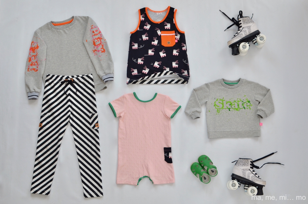
I'm in the final! Am I dreaming? Maybe that’s possible, but it doesn’t matter to me... I will continue to enjoy this unique experience that is bringing me so much joy. In this week's design we must show what makes us unique while using our best skills. After thinking and thinking about this issue without getting any ideas I decided to create this week's outfit in a completely different way. I have tried to forget that I am participating in a contest and have bought some knit fabrics that I have liked for a long time. I have sewn something that my children need and I know that they will use and enjoy. This way, I'm sure I can show my style without forcing it.
As soon as I received the fabrics my brain told me: Let's play! and that was what I did: I played with the knits in different textures, played stripe matching, played with the colors, and played with some crayons, too. I have sewn these garments for both my son and my baby. They are all knit fabric garments that share the base colors: white, black and pink. I have incorporated some contrasting touches in my son's clothes in orange and for the little one some details in green. I wanted them to be harmonic garments in colors without matching exactly. He wears super comfortable fitted pants with pockets applied on both sides with a drawstring at the waist. The sleeveless shirt also has a patch pocket and a print that he loves. I have drafted both patterns from RTW clothes from their wardrobe and the fabrics are both french terry from Fabrics and Friends. It seems simple but has thoughtful details, to my style, like the Kraftex imitating leather. In case it cools down on summer nights I have sewn a gray sweatshirt with grey pique knit that includes an crayon iron-on transfer with the words “Let's play” on the sleeves (pattern from an Ottobre Design.) I decided to use this method so he could get involved in the design and creation of the sweatshirt.
My toddler is wearing a pink romper made of a knit fabric with relief dots, I drafted it from a RTW romper that fits her perfectly. The green border of the neck and pocket stand out a lot from the pink and they manage to lend some happiness to the romper. It has a patch pocket on one side. I have also sewn a gray sweatshirt in grey knit pique that says “Skate” (pattern from Ottobre Design.)
Both words represent what this week's designs convey to me. When you look at the garments I think they scream, “Play!”, “Let's have fun!”, “Bring your skates and go to the park!”
I hope you liked my proposal. I want to take this opportunity to thank all of you who have supported, encouraged and voted for me these weeks. Hopefully the designs that we have been showing you have been very inspiring. There are more pictures and details on my blog, don’t miss it!
And now it's your turn! Please support these talented European designers with your VOTE! Their scores (and the prizes!) will be determined based on the following: